

Databox Reviews: 4.4/5 — Solid Choice
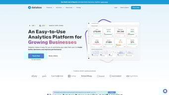
Databox is a cloud-based business analytics tool that lets users create custom analytics dashboards incorporating data from multiple sources, viewable from any device. The platform is specifically designed for high-level executives, analysts, and marketers, and makes navigation easy through single-click integrations, the advanced settings for unique metrics, and time intervals that can be modified and tailored to your needs.

| Capabilities |
API
|
|---|---|
| Segment |
Small Business
Mid Market
Enterprise
|
| Deployment | Cloud / SaaS / Web-Based, Mobile Android, Mobile iPad, Mobile iPhone |
| Support | 24/7 (Live rep), Chat, Email/Help Desk, FAQs/Forum, Knowledge Base, Phone Support |
| Training | Documentation |
| Languages | English |


Compare Databox with other popular tools in the same category.
I like how easy the software functions and how easy it makes my life. It is mainly effective for predicting performance in the future and take control. Also lets you take a free trial if you are unsure if the software is for you.
Occasionally software issues do take place making it difficult to use as well as the pricing can be a little expensive.
Databox has been essential for analyzing what is going on in my business hence allowing me to take the correct steps to grow. It has helped with analyzing customer information which has helped decision making through good data visualization. It has also helped the marketing team to analyze the impact on social media which we can then analyze and control for future projects.
Contém painéis de controle de fácil leitura, que gosto muito dessa função, pois permite ao usuário transmitir informações com eficiência e rapidez, mencionando que adquiriu em sua programação, relatórios para suas necessidades, sejam diárias, semanais ou mensais, Este concorda em estabelecer a estrutura de notícias que melhor se adapta às suas principais preocupações, destacando que é a facilidade de acesso à plataforma de software com apenas alguns cliques para se conectar a um grande número de programas de diferentes sistemas.
Databox precisa implementar novas atualizações de funcionalidades essenciais, como expandir seus conectores API para conexões existentes, e ao mesmo tempo estender uma lista maior de provedores de origem, por outros aspectos podemos destacar que falta integração de várias ferramentas que são mais utilizadas para marketing digital, o que implica que o processo de vendas complementado por este software pode ser um tanto lento e, finalmente, difícil de configurar o sistema.
O Databox é usado na minha empresa essencialmente como a ferramenta de painel do nosso departamento de processamento analítico, usado para extrair análises de vários pontos de dados e criar uma visualização mais fluida, usamos as ferramentas tanto para os nossos resumos gerais de qualquer tópico interno da empresa, como criar dashboards para os clientes como forma de relatar facilmente o que está acontecendo na organização com relação aos esforços de marketing digital que geramos.
The design is very beautiful and versatile, it looks nice on all of my devices. Good Job Databox. Another thing I love about databox is its simplicity, it is simple, and without any unnecessary things, which makes it easier to operate.
It is quite expensive, personally, I only use the basic plan, which is $50 per month. No complaints about the performance.
I use Databox to observe and present my market research data. Databox assists me to do my assignment and I'm satisfied with it.

The ability to access real time data concerning an individual employee in relation to departmental output. Am able to determine weak points in production.
Databox is just the best software I've used to track performance. It has been a huge leap from the manual job cards.
Before using databox my department and company used manual sheets or jobcards to track individual employee output. This made it hard to track actual employee's output versus reported output. With databox the integration of sectional output with individual employee performance has hugely reduced administrative costs.

Everything has been built to make easier the challenge. And if for some reason, I wasn't able to get a solution (it really happened) I contacted customer support, and they gave me gently the way to do it. I really loved Databox.
Nothing (for my use, so far). I can see it's a really complete tool.
To give the right live view of the business for the team.

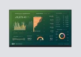
The stunning visualizations is what makes this platform unique & brilliant.
Limited Databoards available. The number of Databoards available should be much higher.
My management loves the reports they receive. Good thing is that the snapshots get attached to the emails so they do not have to open any URL or an excel file to view the reports. The snapshot feature is truly brilliant.
It helped me stay very organized and professional
There wasn't much I disliked about it, it just took some getting used to.
I was keeping all my information in a neatly organized way to make things hassle-free.
I can connect any platform and make a panel of KPIs suitable for each one, so that when the information is updated in real time it gives me an indication that the actions that are being carried out have a consequence on visits, purchases or other activities within the website or mobile apps. For example, if I have an activation event, I can quickly notice the panel updates as the activity increases and from where I am getting traffic.
The price goes up a lot when you exceed 5 panels, personally I prefer that there is a price from 2 panels simultaneously in use or that the panels can be activated or deactivated when they are not in use, this because you need a lot of time to configure one and if the platform it asks you to delete it you have to do it without being able to recover them later if you change your plan.
Concentrating all the KPIs of interest in one place was something impossible before knowing and implementing databox, much less having the data updated almost in real time, with databox we are always updated as to what happens with our followers, how they react to contents that we publish or if we are doing something wrong.
It is easy to connect it to almost all the platforms that I use to achieve the marketing results of the company, it is interactive so I can consult data from previous months, current or have a vision of the results that I will get if I continue with the current strategy, since that extrapolates growth, in case I need another performance indicator I can add it from the default list with just one click.
This tool has been perfect from the first moment I used it, for 2 years more compatible platforms have been added so it is even better.
When I needed to obtain the performance data of ads and content generated for social networks I had to export the data in excel and make formulas to count and add the data of scope, expense, interactions, video reproductions, etc. With Databox I have all these results updated every 5 minutes and I no longer need to export the data in excel to process them.
Nice visual representations of macro data points across multiple platforms.
Needs more customize-able query options for salesforce and other data platforms.
Databox allows us to house all of our macro data points in one place - great for big-picture company dashboards, etc.

