

Databox Reviews: 4.4/5 — Solid Choice
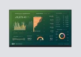
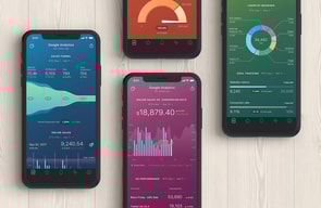
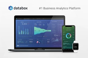
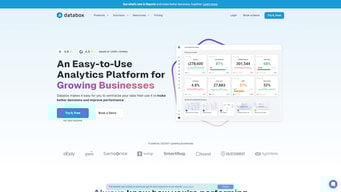
Databox is a cloud-based business analytics tool that lets users create custom analytics dashboards incorporating data from multiple sources, viewable from any device. The platform is specifically designed for high-level executives, analysts, and marketers, and makes navigation easy through single-click integrations, the advanced settings for unique metrics, and time intervals that can be modified and tailored to your needs.

| Capabilities |
API
|
|---|---|
| Segment |
Small Business
Mid Market
Enterprise
|
| Deployment | Cloud / SaaS / Web-Based, Mobile Android, Mobile iPad, Mobile iPhone |
| Support | 24/7 (Live rep), Chat, Email/Help Desk, FAQs/Forum, Knowledge Base, Phone Support |
| Training | Documentation |
| Languages | English |


Compare Databox with other popular tools in the same category.

Databox is an absolute must in my tech stack. After trying most dashboard software out there, I've seriously come to appreciate the ease of use, large number of integrations, and great support that this product offers. As per the title, the visualizations that can be created using calculated and custom metrics are top-notch and make tracking KPIs a breeze.
I would like to see a stronger forecasting feature as well as a 6sense integration (if possible) in the future.
Databox helps our growth marketing department tell a more complete story by combining analytics from the vast majority of our tech stack so we can track all of our KPIs from a single browser tab, eliminating the need for time-consuming Excel spreadsheets, data gaps, and sub-par visualizations.
We like the style of Databox. It doesn't look dated and has been very impressive to our clients. We also love the variety of data connections and ease of set-up.
The data visualization options could use more customization options, particularly with text editing. It's great for basic live dashboards, but we struggle to use this for complete reports because it doesn't give us much of an option for complete analysis. The reports feature is on its way but is not there yet.
Being able to display live dashboards and cleanly. This is by far the biggest strength of Databox.
Available to help and assist at all times, and very kind and knowledgeable support.
not much to mention - sometimes heavy load times but nothing too serious
Visualizing the Data properly helps us make crucial decisions in marketing - and databox does it best.
The custom calculation between facebook metrics and Shopify metrics makes showing ROAS a breeze!
I have a client who's performance is on WIX and there is not current API with them.
Streamlining my client reporting at the end of the month!
The platform is absolutely incredible. OIt makes our work in the marketing field so much easier and our clients to much happier!
Nothing - I love databox! There is not a thing I would change.
The customer service team is incredible. I work with a man named Tim and he is so helpful wit any questions I have! The platform is great for helping us visualize results and gauge ROI.

There are so many things I love about databox. First, it's very intuitive. You don't need to be a data expert. You can integrate data seamlessly from different resources. I have tried power BI, tableau, google data studio. And I prefer Databox. Second, because they work on the cloud, you can easily share the databoards. Last but not least, the people that work there are amazing! The sales rep, Vladimir, was excellent. Then, the support people like Tim, respond within a few seconds, and help you build databoards. I don't know who runs this company. I know they are doing a great job.
There's nothing I dislike about databox.
Make it easy to rework and visualize our data in one place.

The support team is insanely good. Anything that I need they help me with, I'm always blown away. Also, there are built in integrations for everything, so I can usually deliver a great dashboard with a couple of clicks.
Nothing! I like everything about databox.
Databox is solving the problem of quickly visualizing random metrics on the fly for campaign managers using a wide variety of tools. We have several campaign managers in our team, and we don't want to pay for seats for our campaign managers for every single marketing tool in our stack. However, those campaign managers still need access to all of that data so they can learn and reiterate on their campaigns. Databox gets data out of our toolkit and onto a page so everyone in our team can see it regardless of access level.

I like the versatility of Databox very much. But what I like and appreciate the most is the Gold Standard help and support, I always received from helpful, understanding and friendly support team members.
It's not that I disklike what I am about to write, but I would like to be able to see more training videos, more specific ones in order to learn to help myself, eventhough I really enjoy getting in touch with the support team.
It helps me save time, when monitoring our digital marketing performance.

The most interesting thing about the Databox software is its flexibility, the general interface is very intuitive. There are several resources and tools you can use to configure your dashboards to meet your current needs and needs. Databox software offers a wide range of visualization options. The ability to create custom metrics is a very useful and amazing tool. We can modify the measurement display, with advanced data modeling capabilities, the software actually controls all the frames for me. As a marketing data analyst, I am very happy. It brings all our data together in one place We build live/interactive dashboards We define and monitor our performance against goals in making data accessible anywhere, on PC or mobile device, which allowed me to improve all my reports, setting it up is very simple I admire this software for its organization and structure.
The software is limited to 3 panels in the free trial. This can be improved in the databox software for beginners, I know that to get a lot of panels on my account I need a higher subscription, this makes the software value its features and tools being the best software in its category this influences a lot.
With the software I managed to centralize all my reports, the user interface is clean and objective, Databox makes it very easy for me to understand trends and updates are practically in real time, it is a very accessible software for all professionals I started in a few minutes it is very easy I didn't need any prior knowledge of analytics or dashboards to begin with, this was very interesting. I had already tested a lot of other software and didn't have the ease of use, flexibility, simplicity and customer support that I got from databox software is amazing customer support impressed me. It has all the features we need,helps staff stay informed and connected.
Databox is a great platform to help put all your data in one place. From social media, websites, online advertising - it's amazing. My favorite part is the emails you can sign up to receive whenever you want to stay on top of your data.
I can't think of anything I disliked about Databox. Overall, the process is easy to learn, easy to employment, and easy to share with others on your team/department.
Databox makes getting all my social media and website numbers in one place. I don't have to move through several tabs or websites to get my monthly stats, it's all in one place!

